
Antares Auto-Tune Branding
Antares, the company behind the groundbreaking Auto-Tune software, hired me to redesign their logo. What started as a logo refresh evolved into a full brand overhaul. The project expanded to include a new website, trade show environments, print materials, digital ads, promotional videos, and a flexible visual system used across all marketing channels. The goal was to unify their brand presence and increase visibility beyond their flagship product.
My Role
Brand Strategy
Logo Design
Visual Design
Creative Direction
Timeline
3 Months

“When we decided to rebrand our logo, I immediately knew we needed to call Ian based on past successes. He took the time to dig deeply into what our brand represents. Our new logo and visual branding have been a huge hit – he really came through.”
Steve BerkleyThe Opportunity
Antares faced a unique brand challenge. Auto-Tune had become a cultural icon, but that success overshadowed the broader suite of advanced audio tools they offered. They needed a brand identity that could stand beside Auto-Tune, not beneath it. We were brought in to reposition Antares as a leader in audio technology, with a strong, recognizable brand that reflected their innovation and influence across the industry.
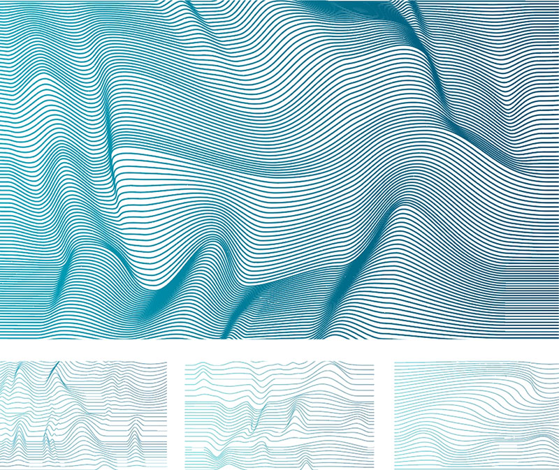
Making Waves
A central element of the brand language we developed was a series of “Wavescapes”—fluid, abstract forms used as background visuals across marketing materials. Designed to evoke movement and sound, these graphics brought cohesion to the brand’s visual system. For digital applications, we added subtle motion to enhance depth and dynamism, reinforcing the brand’s connection to audio and technology.

Championing the Artists
Auto-Tune is an industry standard, trusted by top artists and producers around the world. To honor the creative voices behind its success, Antares wanted to spotlight the people who helped shape its legacy. We incorporated photography and testimonials from leading artists and producers throughout the brand experience, with a strong presence across marketing materials and prominently featured on the website.
The Solution
The final brand system gave Antares a clear, confident visual identity that aligned with their legacy and future vision. A custom logo and typographic system reinforced precision and clarity. Abstract “Wavescapes” became a signature graphic element across campaigns, hinting at motion and sound. We also introduced motion design for digital assets, bringing the brand to life online. Together, these elements elevated the Antares brand and unified their voice across all channels.
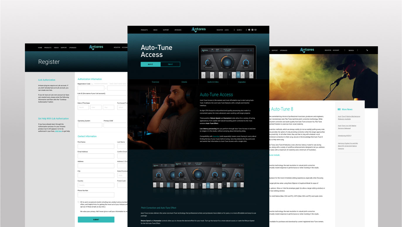
Website design
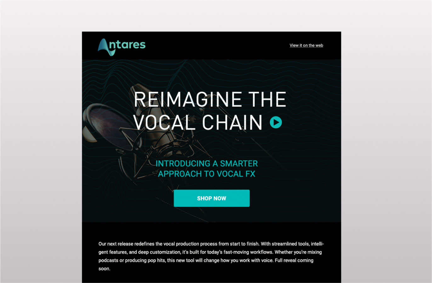
Email template design
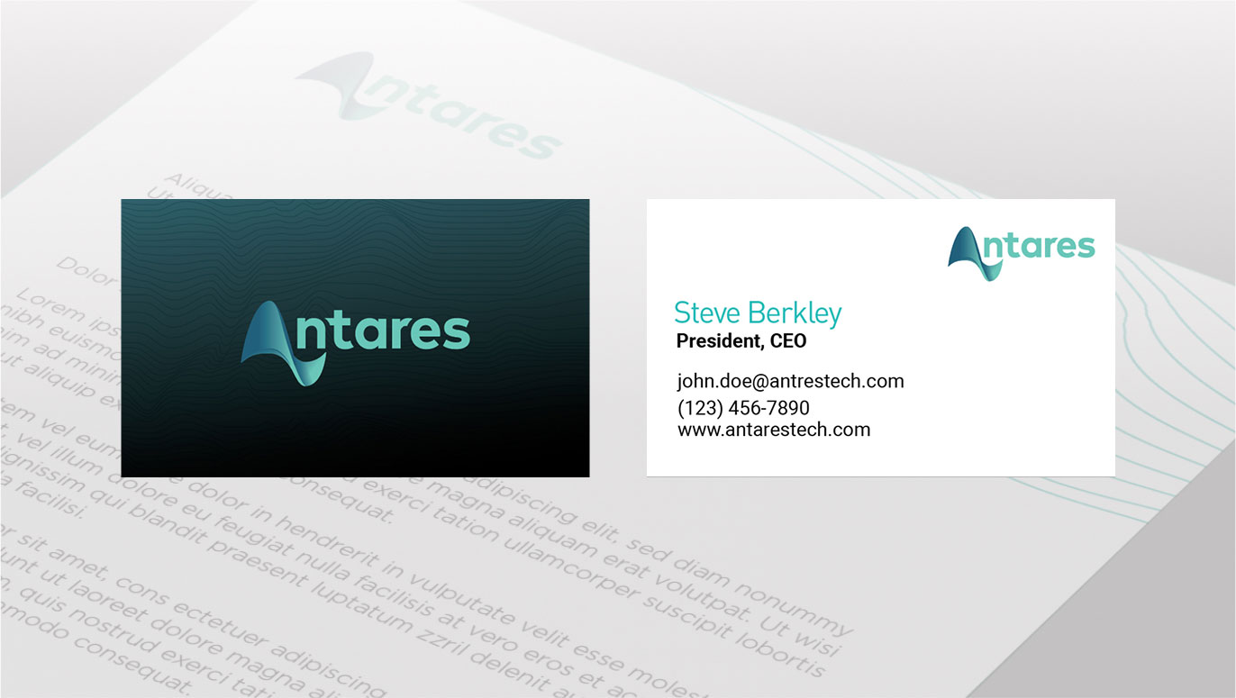
Business cards and corporate stationary